What Makes a Good Logo? A Guide for Casper, WY Businesses
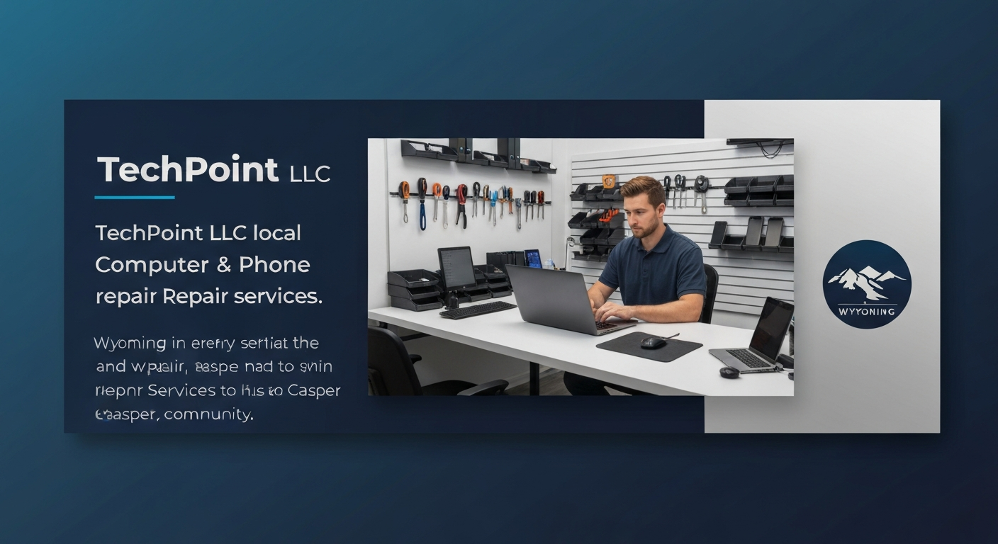
Walk down 2nd Street in Casper or scroll through a Wyoming business directory, and within seconds you'll form snap judgments about a dozen companies — most of them based on nothing more than their logo. A good logo is the single most visible piece of your brand, and for small businesses in Casper, Mills, Evansville, and Bar Nunn, it's often the difference between looking like an established, trustworthy operation and looking like a hobby. Here's what actually makes a logo good, and how to tell whether yours is helping or hurting your business.
Simple Beats Clever Every Time
The best logos in the world are almost embarrassingly simple. Think of the Nike swoosh, the Apple apple, or the Target bullseye — none of them are complicated, and that's exactly why they work. A simple logo is instantly recognizable, reproduces cleanly at any size (from a billboard on I-25 to a 16-pixel browser tab icon), and stays memorable. A logo crammed with tiny details, gradients, and text becomes a muddy blur the moment it's shrunk down. If your logo doesn't read clearly at one inch, it's too complicated.
Memorable: The 5-Second Test
A good logo sticks in someone's mind after a single glance. Show your logo to a stranger for five seconds, then cover it and ask them to sketch it. If they can reproduce the basic shape, it's memorable. If they can't, it's too busy or too generic. Memorability comes from one distinctive element — a unique shape, a clever use of negative space, or a bold color combination — not from piling on details. One strong idea outperforms five mediocre ones.
Appropriate for Your Industry and Audience
A logo for a Casper law firm shouldn't look like a logo for a skateboard shop, and vice versa. Good logos match the tone and expectations of their industry. A repair shop can lean rugged and technical; a salon can lean elegant and refined; a kids' brand can be playful and bright. The mistake we see most often is businesses choosing a logo they personally like rather than one that speaks to their actual customers. Your logo isn't for you — it's for the person deciding whether to trust you with their money.
Versatile: It Has to Work Everywhere
Your logo will live in places you haven't thought of yet — embroidered on a uniform, etched into glass, printed in black-and-white on a fax, displayed on a dark social media header, stamped onto a tiny business card. A good logo is designed to work in all of these contexts. That means it needs a version that works in a single color (black or white), a horizontal layout, a stacked layout, and a square icon version. If your logo only looks good in full color on a white background, it's going to look broken half the places you use it.
Timeless, Not Trendy
Trends age fast. The glossy 3D logos of the 2000s, the flat minimalist logos of the 2010s, and the gradient-heavy logos of today all looked modern when they were made — and dated five years later. A good logo resists the urge to chase the current trend and instead aims for timelessness. Look at logos that have lasted decades with only minor refinements: they're built on solid principles of shape, balance, and contrast, not on whatever design fad is popular this year. You want a logo that still looks right in 2036, not one that screams 2026.
The Right Color Strategy
Color is the most emotional part of a logo and the part people remember most. But good color strategy isn't about picking your favorite shade — it's about choosing colors that communicate the right feeling and that reproduce reliably across print and screen. A few principles:
- Limit your palette: Two or three colors maximum. More than that and the logo loses impact and becomes expensive to print.
- Consider psychology: Blue signals trust and stability (great for IT and finance), red signals energy and urgency (great for sales and food), green signals growth and health. Choose deliberately.
- Don't rely on color alone: A good logo works in black and white first. If it only functions because of its color, it's not a strong logo.
Typography Matters as Much as the Symbol
For many small businesses, the logo is mostly type — the company name set in a distinctive way, with maybe a small mark. That makes the font choice critical. A good logo uses typography that's legible, distinctive, and appropriate to the brand personality. Avoid the overused default fonts (you know the ones — every local business seems to use them) and avoid fonts so decorative they're hard to read. The lettering should feel like it belongs to your business and no one else's.
It Should Look Good Next to Your Competitors
One of the most useful tests is to place your logo in a row with your top five competitors' logos. Does yours stand out for the right reasons, or does it blend in — or worse, look amateur by comparison? In the Casper market, where customers often choose between a handful of local options, a logo that looks more professional than the competition earns trust before a single word is read. This isn't about being flashy; it's about not looking like the weakest option.
Scalable and Crisp at Every Size
A logo designed as a raster image (like a JPEG or PNG) will pixelate and blur when enlarged. A good logo is built as a vector graphic — mathematically defined shapes that stay razor-sharp whether they're printed on a pen or plastered on the side of a building. Always insist on receiving your logo in vector format (SVG, EPS, or AI) so it can be scaled without quality loss. If you only have a low-resolution PNG of your logo, you don't really have a logo — you have a picture of one.
Common Logo Mistakes That Hurt Casper Businesses
- Using a stock or template logo: If a $20 template logo looks familiar, it's because dozens of other businesses are using the same one. It instantly erodes your uniqueness.
- Too many fonts: Three or more typefaces in one logo screams amateur. Stick to one, maybe two complementary fonts.
- Following the client's every whim: Design by committee produces watered-down logos. A good designer pushes back and defends decisions that serve the brand.
- Ignoring the icon/favicon: The tiny version of your logo in a browser tab is often a customer's first touchpoint. If it's a smudge, you've lost a micro-impression.
- Redesigning too often: Brand recognition takes years to build. Changing your logo every couple of years resets that equity to zero. Get it right, then leave it alone.
How a Good Logo Pays for Itself
A well-designed logo isn't a cost — it's an investment that compounds. It makes your marketing more effective because every ad, sign, and social post reinforces one consistent, professional image. It builds trust faster, which shortens the distance between a prospect seeing you and a prospect calling you. And it makes you look like the established, credible choice in a market where many competitors still look like they started yesterday. For a Casper service business competing on reputation, that perceived professionalism directly translates to booked jobs.
Need a Logo That Actually Works?
ON-POINT Media designs logos and complete brand identities for businesses across Casper, Mills, Evansville, and Bar Nunn — built on the principles above, delivered in every format you'll ever need, and designed to look professional for years. Whether you're starting from scratch or your current logo is holding you back, we can help. Learn about our brand and web design services or request a free consultation today.
 TechPoint Wireless & Internet